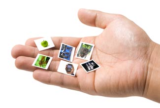
Microstock images often have a 'microstock look'; it's a style dictated by the users of microstock images, users are buying these images so contributors are creating more like them. Traditionally stock photos were not supplied ready to be dropped into a design, they were expected to be edited to the style dictated by a photo editor (a person). Microstock images are more likely to be downloaded and dropped straight into a design with little editing needed.
In this post I explore the differences between images for micro and macrostock (traditional full priced stock). Of course you will find images of all types in both market segments, a key thing to remember is that the 'microstock style' images are the big sellers on the microstock sites.
The style of images that sell is where some professional photographers come unstuck when trying to sell on microstock sites, while their images are technically flawless, well composed and indeed most flexible for the use in designs of any type, they are often not what microstock buyers are looking for, the market demands something 'fast, easy and cheap'
Microstock sites rank your photos on the number of times that people click on them or hover-over for a preview, if your image does not stand out in amongst 30 or so other images on the screen then : it will receive fewer views : it will appear less frequently in the search results : it won't be a good seller.
Subjects
Keeping things simple is the rule, microstock images often just have one subject and no 'layers' of subjects i.e. subjects in the background and foreground. Items cut out of white sell well. Designers using microstock sites more likely to be looking for an image to drop straight onto a page layout or web design than something that will make a good magazine cover or sell a product on its own.
Case Study: Photographer Gordon Ball's Istock Portfolio. His top 6 photos were taken inside his own home (a radiator valve, bathroom interior etc, he wrote about this on his blog). The pretty winter landscapes and conceptual wedding photos which you might expect to be bigger sellers, and which look like conventional stock photography, sell much less often.
Cropping
 I personally like lots of space around images, but unfortunately on microstock sites people really do browse with their eyes and not their heads. The benefit of an image that is not too tightly cropped and that has lots of copy space around it seems to fly out of the window when it comes to microstock. The fact that there is no space around a subject for a bleed when printing is probably a problem for many designers, but from what I have seen the sellers have a 'large central-ish subjects' that look good as thumbnails. Traditional concepts like rule-of-thirds and images which look great when printed on a large canvas may little effect when it comes to people clicking on the download button. There might be an argument that images with lots of copy space (that risk looking lost on the search results page) sell at higher prices and with extended licenses as they are more useful to print designers; tight cropped 'obvious' images that jump out of the search results may sell in larger volume but only at smaller, less valuable sizes as they are used by bloggers and other digital media designers. Given the option experiment with both, certain subjects lend themselves to close cropping better than others. I've seen examples of isolated-on-white objects with variations of copy space on the left and right of the same subject, seemingly for lazy microstock buyers who want cut-and-paste!
Popping
 Image colours and contrast should stand out. This is an area I sometimes find difficult, before microstock came along I would strictly leave all images un colour-saturated and un 'photoshopped' other than spotting and cleaning. All of my images had very minimal pure black and pure white so that the end user could choose how contrasty they wanted the end image. However, take a look at the results from a microstock search you you will see lots of bright colours and strong contrast (remember that the images that appear first in the default search results are the biggest sellers). Images often featuring somewhat cheesy effects simulating fluorescent lighting, warm lighting / sunsets etc. There are probably designers out there who curse this, but the stats speak for themselves, the big microstock sellers are bright and colourful and look good on screen. It seems to not matter if such images don't print as well as they might if they were sold un 'tweaked' and edited for the output format required.
Sharpening
Low levels of sharpening while processing in camera raw or sharpening which is already included into jpeg files by default is acceptable (and advisable), Additional sharpening to make images look good on screen is not a good idea. Images are to be left unsharpened so that the end user can sharpen the image for their final output. Microstock or macrostock your agency not like you for sharpening images.
Conclusion
The amount of image editing you perform will very much depend on the subject. Images which feature real life such as office scenes, travel etc, require little in the way of Photoshop work. Images which are more composite such as montages or items cut out of a white background will likely sell better if their colours are vivid and pop out of the screen. The most important thing to remember is that to some extent your image has to stand it for itself when viewed as a tiny little thumbnail amongst lots of other images.
Related Posts:
What kind of images sell best on microstock sites?


It's quiet in here! Add new comment